LOGOS & IDENTITIES
The official logo and brand identity for New York's Flushing Meadows Corona Park, created for New York’s Parks & Recreation. This park is home to the US Open and previously the 1964 World’s Fair. While designing the logo I incorporated the historic ‘Unisphere’ from the 1964 World’s Fair, a tennis ball and then placed a leaf inside of it. Imagine making all these parts come together inside of one logo.
A recent logo I designed for DOS LEOS a new cigar brand based in Miami, Florida.

Logo I very recently developed for ARENA, a neo industrial rock band from New York city.

This logo was designed for New York’s Central Park for the New York’s Park’s & Recreation group. Central Park is the greatest park in the world, so I invented and created a social, mobile, interactive tour that anyone could play through the park to learn about all the great things in the park, past and present. The logo reflects the playful, winding tour. Oh, and it was also motivated by getting people exercise more instead of just going to the park and looking at their phones;)
Well & Being is a brand new holistic wellness center that launched at the Fairmont Scottsdale Princess Resort in Arizona. I was hired to launch the brand from the ground up. I created the name ‘Well & Being’, obviously a spin-off of well being. The logo icon was something I creative directed and is based off on an ampersand, utilizing three distinct circles to represent their the core areas of focus, demonstrating a path to wellness from the body, mind ad spirit.

Area4. An events planning company based in Shelter Island, New York. This was a really fun logo design for me to create. I remember being in California, working with them, doing sketches for days, then returning to Brooklyn to finalize this idea. It’s clean, modern and concise. It’s telegraphic, with an A4. One of my very favorites.
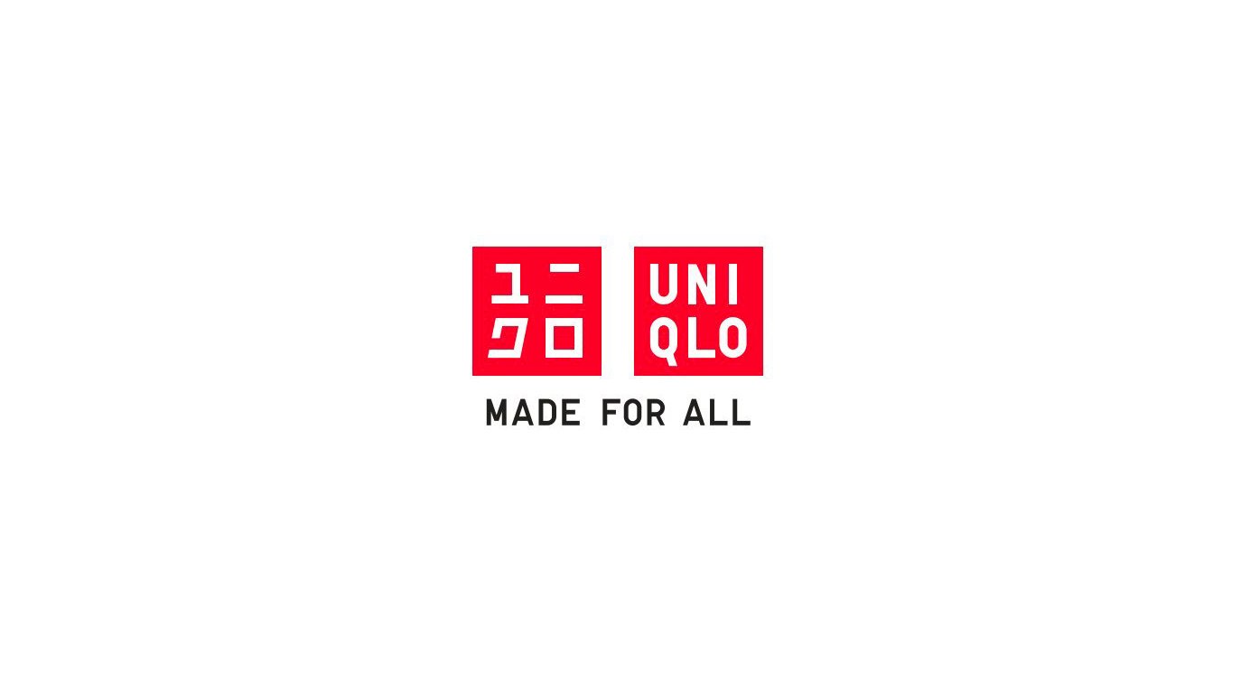
UNIQLO Clothing Worldwide came to me for a brand review and new, worldwide campaign platform. I co-created the MADE FOR ALL messaging platform with my creative partner Yutaka Tsujino. The idea is that everyone looks great inside of UNIQLO clothing because it shows who you are without fashion covering you up, plus it’s affordable. Fun fact: This campaign was the media spend ever in New York’s MTA transit history, and helped keep the MTA out of bankruptcy that year. This logo was designed by the world-renowned creative Kashiwa Sato.
FLIK Hospitality curates and crafts high-end catering presentations for corporate environments. I created this la hand-crafted logo and typeface to reflect the “standup” nature of their premium brand.

ALO Drink, a startup brand came to us for a total rebranding and became the world’s largest aloe vera drink brand in the world in during our time together. We designed and redesigned every touchpoint necessary to launch a first class drink brand. From a logo revision, to full repackaging and bottle design, website, trade show—you name it. Every touchpoint was considered. We didn’t stop there. I developed the concept of creating a new level of value inside every bottle by adding music made for each flavor. It was a way to make the brand more social and interactive while expanding the brand into every online streaming music channel on the globe. As a worldwide brand the tagline Goodness From Inside Out was created, made to be easy translatable and carried the brand into the hands of Pepsi who now distributes the product.—that’s big business for the brand.

MAD Electronics came to my agency asking us us to create their entire brand and product line branding. As the Creative Director, I asked my team to focus on modern sound and images, this logo reflects the modern, forward, progressive nature of their products. The concept behind MAD is “MAD Crazy” in a way that we help ‘connect your master plan’.

ZOTIKO Water, from the word Zoticus is a Latin masculine given name of Greek origin (from Zotikos, meaning "full of life". I didn’t come up with the name, but my team and I had to accept it. Zotiko Water is a prively-held, privately distributed drink brand for high-end, luxury, C-level parties where people “party hard”. Elegantly designed to be responsive under glamorous lighting, it’s also packed with significant amounts of electrolytes and zero sugar. The following link below is to their original brand book, showing you the interior os a beautifully-made, hard-bound book designed for their owner and stakeholders.

LOFI Weekly is a free music database featuring vintage, lofi hip-hip and digital beats. The client was seeking a modern yet vintage look.
Associated Construction is an 80 year old company, focusing on large-scale developments. I created this logo to be both straight forward and telegraphic so that you can the the A from a mile away.
Pixelslave is a web development company who came to me to create their logo. At first the name startled me, then they said it’s based off of Audioslave—one of my favorite rock bands ever.

The Queen of printed dresses, Lilly Pulitzer came to my agency for a rebranding. They didn’t have a specific positioning, nor a specific brand look. With the goal to increase sales at the higher-end of their product line, we worked with them hand-to-hand internally. The final decision was to focus on ‘Resort Chic’, a new category in fashion. Every Lilly Pulitzer dress has a pattern that tells a story just like the stories we remember everytime we vacation. So, when you wear their unforgettable dresses you remember that very moment in your life—the time, the place. It’s a life imprint. And thus was born. the tagline Life in Print was born. The following is an abbreviated internal brand book that shows the interior process for how the creative team first develops each print with art, depicting a special occasion then transfers that art into a one-of-a-kind dress.

The graphical ‘roots’ and logo above was designed for my own agency, Agency Magma Nyc. The logo is based off of the concept of building New Ground. Magma creates new earth, so the logo is a metamorphosis that’s illustrating the roots of a tree, blossoming a fresh new flower. This single flower signifies a new idea. The MGMA mentally combines the G into an A. Since the brand and logo are always seem together, the logo simply lives conceptually and allows the viewer to fill-in the idea with their mind.